- Year of example
- 1945
- Label design
- Philippe Jullian
A picture on a wine label is easier to understand if you first look at its colors and shapes, then read about the artist and the background of its creation. How the lettering and picture share the space is also part of looking at it. You can read this small image through publicly available label materials without buying a bottle or drinking wine.
Key point Find the shapes and letters that catch your eye first, then use the year of creation and the explanation of the artist’s work to explore why. Keep the impression a picture gives separate from judgments of the wine’s quality.
What to notice
- On a label, the lettering and empty space around a picture guide the eye along with the picture’s size.
- Knowing the historical background can change how you read a letter or symbol that first seemed ordinary.
What you notice first in a small image
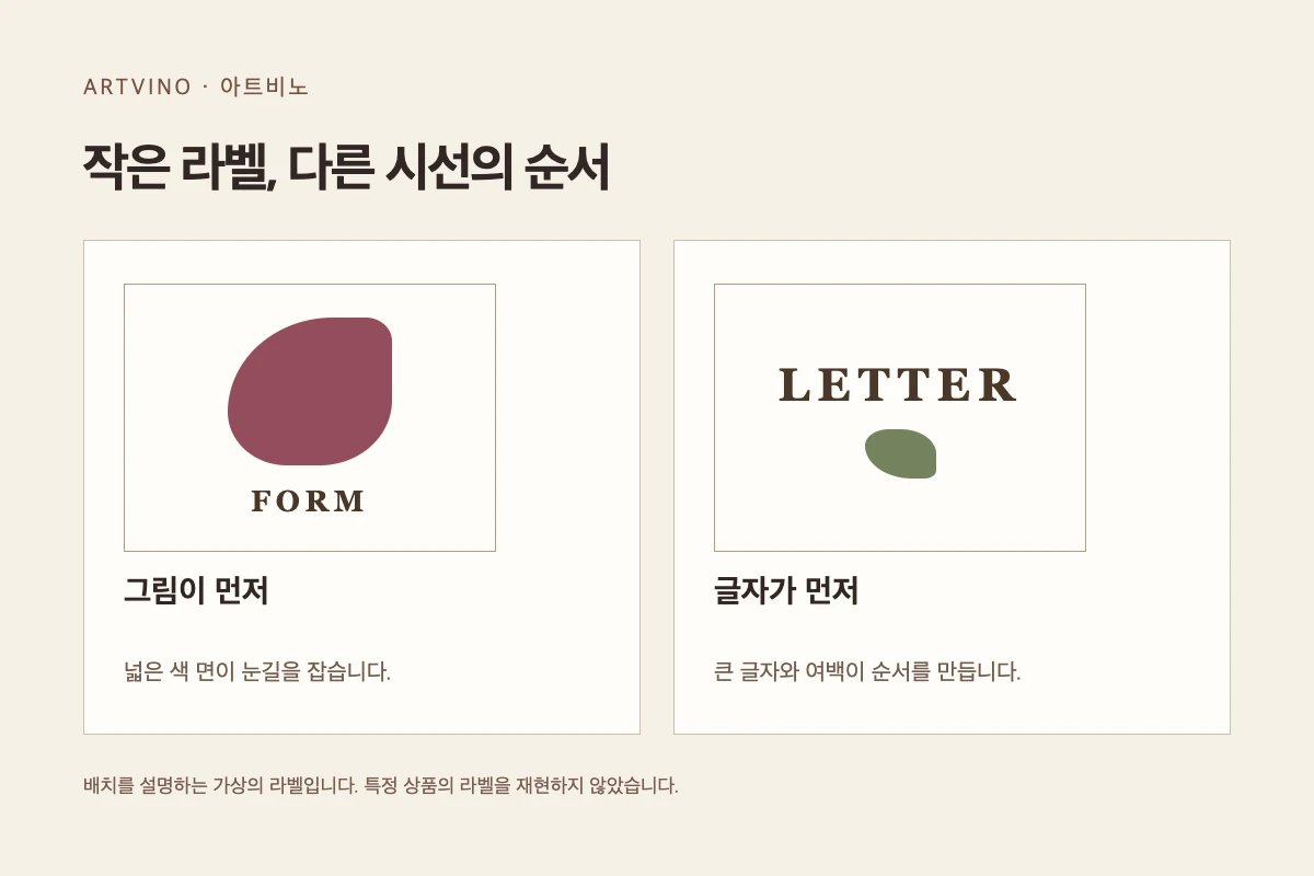
You do not need to read every word on a label at once. Start by looking at whether the picture occupies a large area or the name appears in larger type. Even in rectangles of the same size, a picture gathered in the center and lettering arranged around the edges lead to different reading orders. Empty space may seem to contain nothing, but it helps distinguish the picture and lettering beside it.
For example, a small dark shape on a light background may catch your eye first. Large light letters on a dark background may be read first instead. These are hypothetical arrangements for looking at labels. They do not describe the actual design or taste of a particular product. Use them to put into words where your gaze rests in an image.
The letter on the 1945 label
Château Mouton Rothschild’s 1945 label used a design by Philippe Jullian. The producer’s label archive explains that it was commissioned to commemorate the Allied victory and celebrate the return of peace. The design is based on V, the first letter of the English word “victory.” This example shows the difference between seeing a letter simply as decoration and seeing it with knowledge of the background at the time.
After reading about the background of its creation, return to the picture. Look at how the V catches your eye and how it relates to the surrounding elements. The person who designs the label and the person who makes the wine have different roles, however. Knowing the picture’s historical meaning does not let us judge the taste or value of the wine.
Questions to keep when reading about a picture
Once you find the artist’s name, look at whether the picture was made for that label or an existing work was used. These are different routes by which an artwork and an object come together. If the explanation does not say, it is fine to leave it as unknown. There is no need to invent a commissioning process or form of collaboration from a famous artist’s name alone.
In your notes, record the elements that caught your eye and the parts you saw differently after learning the background. You might write that a large letter caught your attention first and that learning when it was made helped you read its commemorative meaning. You do not need a shopping list to read a label as a small picture. The images and explanations in an official archive are enough to explore the relationship between pictures and printed objects.
Notes
- The reference link provides material for checking the background of the label’s creation. It is not a product recommendation or sales guide, and the label image is not reproduced here.
Sources
Sources consulted for this article.